 Introduction:
GPO Company is a Hong Kong securities investment company. Its main business is to help investors enter the primary market. In order to adapt to the new market changes, the company proposed to design a new image to better expand its business.
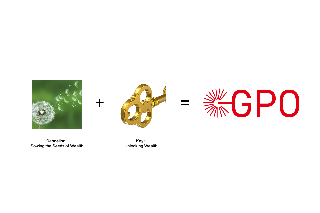 Logo design concept for GPO Company by Logotity:
The design inspiration for GPO Company’s logo comes from the dandelion and the key, which are cleverly combined to symbolize GPO Company’s core values and unique mission in the financial sector. The dandelion represents hope and dissemination, signifying GPO Company’s commitment to sowing the seeds of wealth for clients, helping them achieve financial growth and wealth accumulation. The key represents unlocking the doors to wealth and opportunity, highlighting GPO Company’s expertise in securities investment and asset management, guiding clients towards the path to success.
The overall design of the logo features simple lines and a vibrant red color, not only emphasizing the professionalism and stability of the financial industry but also conveying GPO Company’s spirit of enthusiastic service and proactive approach towards clients. The elements in the logo are organically integrated, maintaining visual harmony while showcasing GPO Company’s brand characteristics and industry attributes as a Hong Kong securities investment agency.
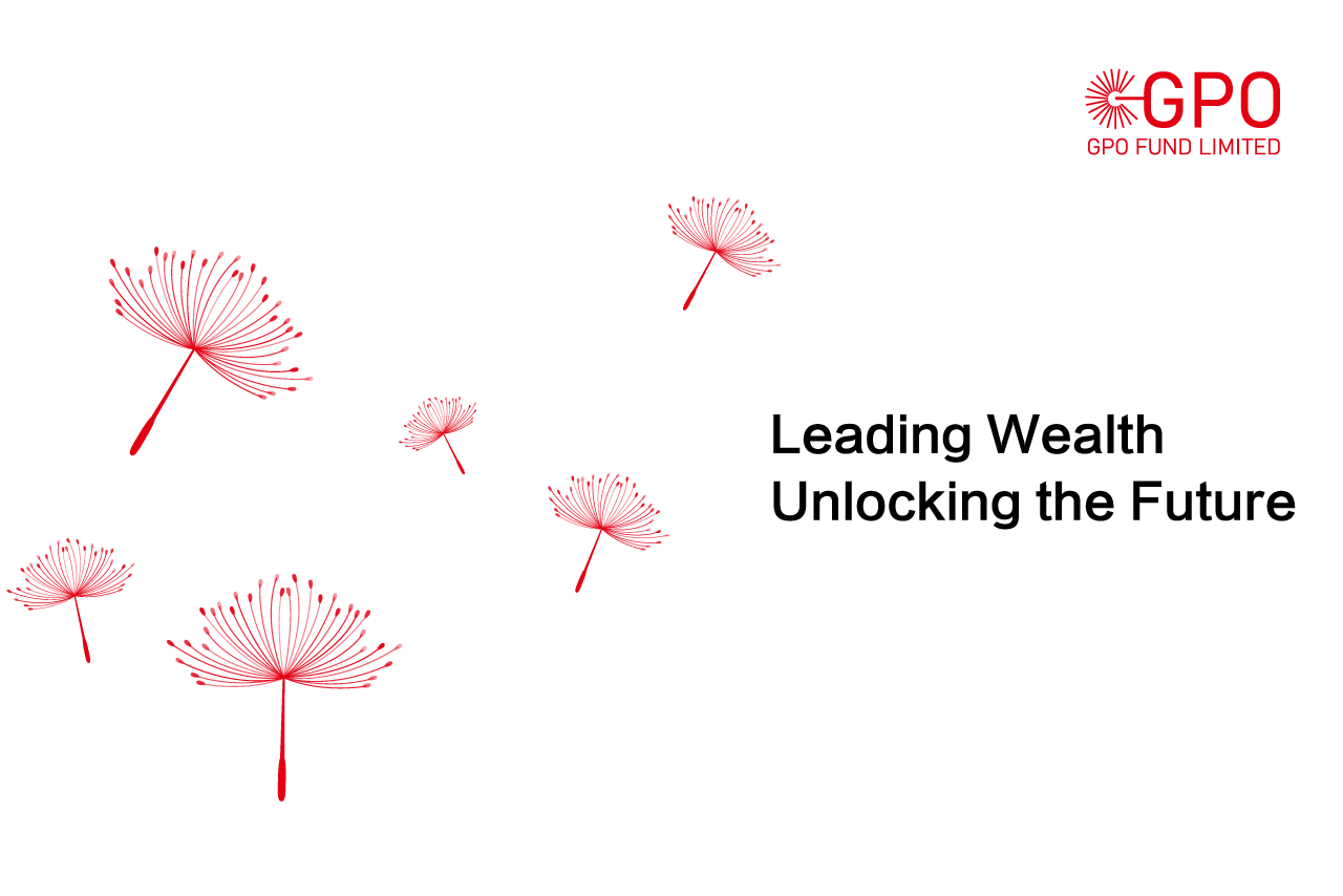
Core Values for GPO Company by Logotity:
GPO Company upholds the philosophy of “Leading Wealth, Unlocking the Future,” dedicated to providing every client with transparent, efficient, and reliable investment services. Through continuous innovation and optimization, we strive to maintain a leading position in the competitive market, create more value for our clients, and achieve long-term mutual success.
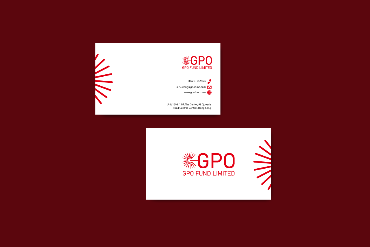 Business card


